Leaderboard Ad

Showing posts with label science fiction. Show all posts

Monday, August 3, 2015

Indie Comics Review: Salvagers ISSUE 1

SALVAGERS: Visual Storytelling Done Right


There are many space opera sci-fis out there. Stories where you watch characters go from nobodies on a farm to galactic heroes whose names are spoken in awe by its denizens. SALVAGERS is not one of them; though that's not a bad thing.

I was given the opportunity to read their first issue when the creators of Salvagers graciously gave away free PDFs of the book to celebrate 10k followers. This premiere of the series quickly introduces us to the crew of the Harrier, the calculating Teagan bickering with the computer A.V.R.I, the quirky Brigby, Mighty T'yr, and of course the roughneck Cpt. Roanick. The first novel introduces them not as heroes but blue collar labor, a theme of the series that originally drew my interest. These "Salvagers" are a group of people trying to make money harvesting old wrecks that are drifting through space post a huge galactic war.

Bob Salley really nails a few features of this first book. In a one page blurb without too much text he is able too give you context so that you can grasp the state of this galaxy and basic economics, it was so short and sweet that I wish George Lucas could have seen it before making episode 1 whose dialog was washed out with economic and trade discourse. The first issue also really drives home the relationships of this crew, while they are concerned about each other, they aren't tight as family; rather they are coworkers - trying to do a job while not getting killed by automated security in

Its this "let the page speak" presentation that I really admire as a fellow comic creator. Too often you have huge blocks of text that are hogging otherwise beautifully rendered pages that try to educate the reader about the world their entering but only end up alienating them, even more so if the book is a science fiction piece. It is something that I feel plagues the industry especially "the big 2" who often need these word chunks to outline decades of prior history and timelines of their characters. Its terrible, and that is why Marvels "nuff said" series in the 90s really spoke to me... No pun intended. They used pictures exclusively! That was remarkable for the entertainment industry that has gotten too reliant on narration, reading large blocks of text,
and seemingly unable to leave things implied.
otherwise dead warships or sucked out into space. In just 24 pages he is also able to give you a firm grasp of who these characters are using subtle hints in the communication between each crewmember, such as Brigby betting on T'yr destroying something emphasizing that character as a bruiser sort of archtype.

Let me get off the soapbox simply to say that Salley has started strong. It allows the artist that he works, George Acevedo to create really engaging gritty images. These are chock full of Jim Lee levels of detailed backgrounds, and he creates doodads and circuit panels and so many other eyecatching inventions to fill the image. One page I really liked visually was page 5 where Teagan is arguing with the computer , Acevedo doesn't just fill the screen with nonsense, he has actual blueprints displayed their of the wreck they are investigating. A ton of work for such a simple detail that only seen on one page. That's crazy! I like that kinda crazy. As far as his visuals his visual story telling and even his stylistic leanings remind me of early Adam Kubert work, specifically on the 90s X-men. Its this ability that really moves the action along and allows your eye to flow smoothly along the page.


As far as lettering goes there isn't really anything groundbreaking or special there and the letterer does a capable job telling a story. That's not to downplay that ability as early letterers often can make a mess of the page. The one thing they may have considered is when transporting the letters from whatever program they use they might want to consider adjusting its color as black text moved from a program like Illustrator to Photoshop lose their crisp black element, and you end up having words and word bubbles that are grey and it just looks a little lazy and sloppy.

Those minor nitpicky grievances aside my interest was originally peaked in Salvagers because of a little number called Starlight Tavern. A comic-strip comedy that is an extreme foil to Salvagers, as Salvagers tone overall is dark and has muted colors and thick dark inks, the Starlight Tavern, meanwhile, is fun and bright and welcoming. Both series are worth as shot, and I think these guys really have something special. They have 2 other issues of their book out and a 4th on the way so you don't have to worry about the series ending on a frustrating cliffhanger... You can salvage them from Comixology or their store.

All in all, Salvagers was a refreshing break from the norm of glorified farmboys in space, and I have to say I'm looking forward to more.

This guy SirGryphon is a scifi junky and he eats it for breakfast and dinner. He works on his own scifi over at Gryphon Knights Comics called the WOW Signal

Thursday, June 25, 2015

Webcomic Review: Starlight Tavern

Starlight Tavern is a enjoyable sci-fi comic strip created and Written by Bob Salley and Jason Sparich and illustrated by Juan Calle. This hilarious series of strips pokes fun at many archtypes and tropes in the plethora of science fiction franchises.

The Starlight Tavern is its own absurd restaurant at the end of the universe run by a plucky ragtag group of peoples who are just trying to keep service running smoothly despite inevitable chaos that often haunts their little deep space establishment. They are often visited by familiar denizens of the galaxy such as the Lost in Space crew, Mr. Spock or even Flash Gordan singing his own theme song to provide some entertainment (A comic that I had to share in this blog as it is my favorite as of yet!).

However, not all their patrons are as well behaved as those mentioned; like most drinking establishments its not without its bit of scum and villiany as monsters litter it's tables and restrooms as well.

Even with these recognizable guest stars the cast  of Starlight holds its own, and refuses to be overshadowed by such well known faces. The colorful cast of the overworked and underpaid staff try to make it by interacting and flirting in a well executed sci-fi version of "Waiting." The wait staff are emotionally inviting providing more than just punchlines, as a welcoming lens of familiar in the midst of the strange intergalactic goings on that passes through their establishment.

They add to the a-list by adding their own new alien characters to the mix, exploring strange scifi what ifs. Like the more recent strip where they reenact elements of Deer Hunter in space. They also relive other famous movie moments often calling In its supporting cast whose unique hijinks keep things familiar and fresh. Such as its own Stormtrooper knockoffs that act as the Moe, Larry, and Curly of the group getting into trouble and sabotaging each other.

Flash Gordan serenades the bar
Though a parody comic, they don't hold back on the art, which is well crafted using thick lines, bright colours and two-tone shading techniques to bring the book to life. One of my favorite things to see is watching artists expressing familar characters from popular series using their own style, and its exciting to consider who might show up next. I have been hoping to see a Farscape cameo, but none as of yet-which means I just have to keep reading.

But it doesn't start at Starlight Tavern as it seems to be its own spinoff of the creators comic series, Salvagers; a story that explores the dirty blue collared element of the galaxy. You don't have to read Salvagers to get Starlight as it holds its own even without a strong linear narrative. Instead I find myself curious about the comic from reading the webcomic. A humorous webcomic featuring much of the familiar in scifi is an innovative way to invite interested readers into a whole seperate series which features elements that are found in Starlight Tavern.

So i'd recommend giving Starlight Tavern a pour and then try out some Salvagers for the next round!

Sir Thomas J. Gryphon is a blue collared fellow, that is dead broke from illustrating books like WOW Signal for biscuits. You can see his work at Gryphon Knights Comics.

Bib
http://www.starlighttavern.com/salvagers.html

http://gryphonknights.com/wow-space-race.html

Tuesday, May 19, 2015

Webcomic Review: Starveil


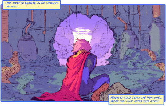
David Rapoza is an artist that continues to grow in popularity and whose thoughts on the freelance industry are great to chew on. His artwork is gritty and detailed and fun to stare at, he even has instructionals on his process up on youtube. What gained him a lot of notice was the hi res, & detailed ninja turtles that he created over 4 years ago.

Its always interesting to see when an artists creates solo work, the piece he started a few years ago was a webcomic called Starveil. This webcomic kinda feels like an homage of everything that was awesome as an American boy growing up in the 90s. It seems to have elements of Dragon Ball Z, Mad Max, old anime, space operas all thrown in a blender. "Will it blend?" Hell yeah it does.

Along with his gritty style the book is fast paced and displays plentiful and powerful action. The palatte he chose for the backgrounds allow for his characters to pop off the page, and the faded pastel colors make the world he's crafted thus far seem truly alien. A feature that is emphasized by his use of negative space is sublime as certain elements spill out of the panels and into the gutters.

My only qualm artistically with the book is his lettering. While I still love his color choice in bubbles and have no issue with his decision in font, its the layout that bugs me. It seems to have many errors of a neophyte letterist, such as bubbles being to long, or dialogue not being centered and touching the bubble borders... Bubble Borders.

The story isn't anything ground breaking, as of yet, as the "hero" of the book is trying to rescue a beautiful stowaway from his crashed vessel and encountering antagonists on the way. What is innovative is how Rapoza takes advantage of tumblrs' gif ability and uses short animations featured in certain panels that help bring the book to life. Action scenes come alive as characters walk toward you, or energy beems fly across the page and increase the already speedy pacing of the book and makes you feel like you should be listening to DragonForce while reading.

The dialogue tends to verge on being a little slow, and self aggrandizing. Though I feel like this element is homaging the taunts and challenges of characters from certain series like Dragon Ball Z or Conan the animated series. It could also be a nod to the silver age of comics as panels used to be densely packed with words and exposition.

What I've really enjoyed from the series isn't even in the book itself but in his extras, the portrait gallery. The character designs there are so eye catching and colorful as classic cartoon heroes used to be. Its even more enjoyable when a character from the gallary enters into the book and you can see them in action. Its kind of like when your favorite X-men was finally featured on an episode of that 90s X-men animated series.

The series so far has me wanting more but unfortunately there has not been an update in a while. Rapoza has a patreon running for the creation of this webcomic and has said that certain contractual obligations have forced him to keep it hush hush for now. He has also posted random images from the book on his tumblr showing that work is still continuing on it and it may yet still see print. However if you want more of his comic work now you can always check out his hilarious series Steve Lichman about a Lich trying to get by in these crazy modern times.


That guy Sir Thomas J. Gryphon is okay, but overhauling the Gryphon Knights website has driven him batty. You can see his own sci-fi work on series like FvD or WOW Signal.

Sunday, March 29, 2015

Webcomic Review: Ava's Demon


When I review webcomics I try to see it from every sensory perspective, and I often relate experiences with consuming food. For example a good comic can linger in your mind, just as something flavorful might linger on your palate. I'm giving you a little bit of my insight because as a creator I believe in being open with my process, but I also have a challenging task ahead of me. 

Have you read Michelle Czajkowski's Ava's Demon yet? If you haven't I am now going to try to convince you that if you consider yourself a webcomic reader than you must. The challenge I was talking about previously was that I need to convince you that this work is a webcomic masterpiece, if not a masterpiece in itself! I know those are strong words to just throw around, however, I hope from my other reviews that you understand I don't use them lightly.

I was originally told about Michelle's work from a friend who works at blue sky and might be known for his work called Dollar Store Combines.

Being very busy in illustrating a variety of comics I was hesitant to start reading another since taking time for entertainment can be risky. Either you've wasted time starting something that was a bust, or (and this is the scarier possibility) you may lose time by becoming absorbed in binge reading because you can't get enough.

Ava's Demon ended up being the latter. You are welcomed to this webcomic by an eerie tomb that seems to glow hauntingly red. Opening it you see just one panel of a girl scribbling in a book. Its counter to what many comics or even webcomics do with their formatting. Pages that are landscape or portrait containing anywhere from 3-12 panels on average. Instead Ava's Demon's panel by panel format is more cinematic and is refreshing because it allows you to appreciate the beautifully painted image as a single piece before moving on. Many other comics paneling pushes a reader forward where Ava's asks you to linger. And linger you should, each panel is beautifully digitally painted and rendered, capturing the mood with its intense lighting, and whose cartoonishly styled characters powerfully emote to further draw you in. All this added to Ava being artistically beautiful but at the end of the first chapter is what captured me as an Ava fan! Each chapter concludes with an animation accompanied by music that truly leaves Ava as not just an amazing webcomic, but an excellent multimedia creation!

The first page of this  dynamic sci-fi introduces us to Ava, a girl we quickly find is highly disturbed, and her demon who seems to be a hidden personality that wants to snuff out the young girls life. It seems like a complex thing to convey but this aspect of the story isn't unfurled in the first five issues, or even the first five pages, but within the first five panels. This is typical of Ava's storytelling, as it conveys seamless storytelling that with its magnificent imagery, and as the story progresses we are found in a postwar universe whose conqueror is heralded as a god. Just the information I shared makes the story address issues of a person resolving their inner demons as well as bringing up the concept that our history and our gods tend to be those of our conquerors.

With two books already published and a third on the way, Ava's Demon seems to be on the crux of being the next legendary space opera! You can help her continue to create by donating to her Patreon!

Sir Thomas J. Griffin is a son of Lilith working for Gryphon Knights Comics and is currently exercising his demons by illustrating an anthology called Frankenstein vs. Dracula: Throughout the Ages with 11 other talented people!

Friday, October 24, 2014

Webcomics Review: Fighting Stranger

I draw a lot of webcomics for GryphonKnights Studios  but on my down time I also like reading and discovering new webcomics. Sometimes they really pull me in and I find myself waiting for the next update. Usually it's only a one page update; the story doesn't progress much. But once in a while that one page changes everything.

Fighting Stranger written by Adam J. Monetta & Illustrated by Juan Romera, starts off with a beautiful splash page; A man in a cloak finds himself standing over a city remembering no more than the city's name. He wanders into the tiny cramped metropolis, and finds it to be a  mostly, deserted wasteland. He's tries to kill a fugitive mutant and is led out of the city towards another.

A man in a cloak finds himself standing over a city remembering no more than the city's name, This purposeful repetition and mimicry of the event that starts the book is what immediately sets Fighting Stranger apart from any other dystopian sci-fi. When I came to this point, I wondered if I accidentally started the comic over, and my sense of disorientation and uncertainty at this moment made me realize that I was sharing the feeling of the main character of the series. Arriving at a similar point, not sure exactly if we've been here before. It's this ability to allow the reader to empathize with it's protagonist that made the series go from entertaining to riveting, as you begin to wonder and read as the mystery of these cities and the stranger slowly unravel.

The Stranger isn't a very compelling character. He is a worn rugged mercenary archetype. The supporting cast, however, kicks ass! The citizens of this world are constantly trying to manipulate the stranger for their own ends. The Strangers stoic persona, is countered by these characters from C4D to Lacey, whose rough existence creates entertaining, dark humor which immerses me in their world.

The art and coloring of this gritty, arid planet draws you in. The colorist is excellent at conveying texture on every element of the set, from the cold metal of a gun to the rocks to the red sky. I am also a fan of the lettering, particularly  the robots' font.

I would be loath to forget mentioning the action sequences. They are amazingly story-boarded! The fights with the mutants each is laid out like a video game boss-fight, as certain mutants only have a couple of weaknesses.

So step into the rough world of The Fighting Stranger and then let me know what you think of the series, and we can theorize together!

Signing off!

T Griffin would also be remiss to forget to mention his own sci-fi, non-dystopian works WOW! Signal and Felix and Saw

Thursday, September 18, 2014

Dollar Store Combine

     A friend posted a few pics of dollar store toys that he frankensteined one day and I was in love. I thought the concept the execution and the final product were amazing. They were so good I decided to draw some fan art of two of the characters from his lot.

 
     We eventually posted this image on our site with a title "Felix & Saw." It originally was an april fools joke as the image just seemed so ridiculous, but eventually it grew into something bigger--an idea, that my brother and I eventually fomented into an actually title.

     You can see all of Dollar Store Combine on their tumblr http://genustoys.tumblr.com/

T Gryphon

Wednesday, December 18, 2013

WOW! Signal Rebirth

WOW Signal was a fun title to create. I may have mentioned before that I started it to force myself to learn how to draw and color digitally. I started working on the computer about 8 months ago using both adobe photoshop and Illustrator.

Since then, from trial and error and watching tutorial videos online I've had great leaps in my ability. I finished work on the first issue of the Wow Signal which ended up being 15 pages long. I then started work on the second issue. Those first 3 pages of the second issue looked so much better then the first that I decided that I wanted to go back and re-illustrate the first issue of the WOW! Signal so that the style and the images were consistent. I also decided to tweak some of the story telling.
April 2013

If you check the images on the right you can see the difference from the first time I drew the starship Namalsadirah and the second. I also have become better at creating space locales and planets.

A lot of what I learned was often details can help create a complete and realistic image.

December 2013
Taking time to recreate the first issue, has helped me appreciate the amount of growth I've experienced and enjoy the new work that I have been creating.

You can see more of my artwork @ http://sirgryphon.deviantart.com/art/Rebirth-of-the-Namalsadirah-420593958

You can also read my book WOW! SIGNAL and other free comics at http://www.gryphonknights.com/


Sunday, October 20, 2013

By George He's Got it

By George He's Got it

     So after 14 pages of creating a digital comic "WOW SIGNAL!"  I finally got a hang of the program I am working on. I have been using a mix of an Adobe Illustrator CS 3 (Which is very old at this point) and Adobe Photoshop Elements. 

1st page of Wow Signal
<<< So here is where I started out with the first page I created. It was kinda tough when I had never drawn directly on a computer before (I have colored pieces on the computer before). In fact the first panel of this page was a test to see what I could do when I transferred my pen and ink stills to the pixel realm.

     I was pretty surprised as to what I could do and decided that I would like to keep up with it. I started to create a story to help push me to craft images to go with the tale. Each page I kept adding to my ability of working with these two programs, until I was more adept at creating a more professional piece on the computer.

Page 1 of Issue 2
     After I got to this level I decided to evolve my style so it would stand out and add to the level of professionalism. I was heavily influenced by the artwork of Brandon Graham as well as other artists who worked on his book Prophet  which is a sci-fi tale that was adapted from Rob Liefeld's original story. What I ended up with I truly liked and after a few sketches I made two covers and then the first page of the second issue with this technique. It took me a long time to find a style that I was really confident and proud of, but now that I have you can look forward to some awesome updates of GryphonKnights free webcomics!

I have some demo and instructional videos on the Gryphonknights Youtube:

https://www.youtube.com/channel/UC44OoVir28whelh38eNrnHA

Sunday, July 28, 2013

EVOLUTION: Uniforms

First page created on computer
When I first started Wow! Signal, I had a very good concept of what I wanted to write about and where I wanted to go with it. What I didn't have was any designs for the book, and very little experience drawing on the computer.

My first attempt at a page was alright and in fact this page was a test to see how my abilities reflected to the computer and was later integrated in the story. My control was really thrown off as I was used to working with pen paper and marker and paint. However,  having a story that continued and a deadline that I was supposed to meet pushed me to keep creating pages.

The one thing I decided, since this was a free comic was that I would allow the design of certain elements to evolve. The most major example was in the uniforms. In the book the uniforms were a different shades of purple and that was it. I understand that consistency is great to have, but evolution I feel is also good. I feel like sometimes books can get stuck, and some books retcon too much. All I wanted to do was allow my designs to grow with my ability. As you can see, I really got the knack at working on the computer, and not only that, but I allowed myself to refine and improve the designs of the uniforms.adding a mix of the violet, and a Gray-blue color for the majority of it as well as cybernetic boots. My feelings were that I wanted the uniforms to be more modular so you could equip them with whatever you needed for the task at hand.

I've been playing around with growing from this as well but I don't think its necessary at this time. The ship the Namalsadirah also changed over time but I will talk about that another time. I hope you continue to enjoy The Wow! Signal.

Saturday, July 27, 2013

An Introduction & a WIZARD

So I've been an artist with this team of Gryphon Knights Comics for about a few months now and we've gotten some cool stuff done.

We've redesigned an old site, we've got a Twitter up and running, we have a vibrant facebook with lots of extras and images, and then of course there is our website for Gryphon Knights Comics, to which we have recently added another comic. All in all its a fun gig. I feel like the coolest thing about our site is that we offer most of our books for free to readers with the exception of Greasers in Greece.

My contribution to the site is illustration for the book HERO, and I write and draw the Wow! Signal and I co-write and illustrate the Meanwhile books. You can also find a bunch of my other artwork on my deviantART page.

So introductions aside this blog will be run by the three owners of the company to talk about it, their influences on their art especially what has helped inspire them to create the books they have.

With that said let me impart on you a little advice the Simpsons once gave me: If you are ever in trouble, just blame The Wizard...

Tom Gryphon
"A WIZARD DID IT!"