

David Rapoza is an artist that continues to grow in popularity and whose thoughts on the freelance industry are great to chew on. His artwork is gritty and detailed and fun to stare at, he even has instructionals on his process up on youtube. What gained him a lot of notice was the hi res, & detailed ninja turtles that he created over 4 years ago.
Its always interesting to see when an artists creates solo work, the piece he started a few years ago was a webcomic called Starveil. This webcomic kinda feels like an homage of everything that was awesome as an American boy growing up in the 90s. It seems to have elements of Dragon Ball Z, Mad Max, old anime, space operas all thrown in a blender. "Will it blend?" Hell yeah it does.
Along with his gritty style the book is fast paced and displays plentiful and powerful action. The palatte he chose for the backgrounds allow for his characters to pop off the page, and the faded pastel colors make the world he's crafted thus far seem truly alien. A feature that is emphasized by his use of negative space is sublime as certain elements spill out of the panels and into the gutters.
My only qualm artistically with the book is his lettering. While I still love his color choice in bubbles and have no issue with his decision in font, its the layout that bugs me. It seems to have many errors of a neophyte letterist, such as bubbles being to long, or dialogue not being centered and touching the bubble borders... Bubble Borders.
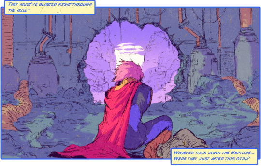 The story isn't anything ground breaking, as of yet, as the "hero" of the book is trying to rescue a beautiful stowaway from his crashed vessel and encountering antagonists on the way. What is innovative is how Rapoza takes advantage of tumblrs' gif ability and uses short animations featured in certain panels that help bring the book to life. Action scenes come alive as characters walk toward you, or energy beems fly across the page and increase the already speedy pacing of the book and makes you feel like you should be listening to DragonForce while reading.
The dialogue tends to verge on being a little slow, and self aggrandizing. Though I feel like this element is homaging the taunts and challenges of characters from certain series like Dragon Ball Z or Conan the animated series. It could also be a nod to the silver age of comics as panels used to be densely packed with words and exposition.
 What I've really enjoyed from the series isn't even in the book itself but in his extras, the portrait gallery. The character designs there are so eye catching and colorful as classic cartoon heroes used to be. Its even more enjoyable when a character from the gallary enters into the book and you can see them in action. Its kind of like when your favorite X-men was finally featured on an episode of that 90s X-men animated series.
The series so far has me wanting more but unfortunately there has not been an update in a while. Rapoza has a patreon running for the creation of this webcomic and has said that certain contractual obligations have forced him to keep it hush hush for now. He has also posted random images from the book on his tumblr showing that work is still continuing on it and it may yet still see print. However if you want more of his comic work now you can always check out his hilarious series Steve Lichman about a Lich trying to get by in these crazy modern times.
That guy Sir Thomas J. Gryphon is okay, but overhauling the Gryphon Knights website has driven him batty. You can see his own sci-fi work on series like FvD or WOW Signal.
No comments:
Post a Comment